Building the Perfect Look: Top General Contractor Logo Design Trends
Why Your General Contractor Logo Is Your First Sale
General contractor logos are often the very first thing a potential client notices about your business — before they read a single review or make a call.
Here's a quick look at what makes a great general contractor logo:
Key Elements of Effective General Contractor Logos
Industry symbols:
- Hammers, wrenches, cranes, and hard hats
- House silhouettes or building outlines
- Rooflines, excavators, or gear icons
Color palette:
- Deep blues — trust and professionalism
- Safety orange — energy and visibility
- Charcoal or black — strength and authority
Style options:
- Modern/minimalist — clean lines, flat design
- Vintage/retro badge — bold, established feel
- Geometric/abstract — precision and innovation
Typography:
- Bold, masculine fonts for readability
- Wordmarks or monograms for scalability
- Must read clearly at any size
Think about it this way: most homeowners in 2026 encounter your brand on a phone screen before they ever see your truck or crew. That means your logo isn't just a nice-to-have — it's a trust signal that either opens the door or closes it.
A strong logo tells people you're professional, reliable, and serious about your work. A weak one — generic clip art, clashing colors, unreadable type — can quietly cost you jobs without you ever knowing why.
Whether you're starting fresh or rethinking an outdated look, this guide covers the top design trends and practical tips to help you build a logo that works as hard as you do.
I'm Angela D., an SEO Account Manager with experience helping construction and home service businesses strengthen their online presence — including the visual branding that makes general contractor logos stand out in competitive local markets. In the sections below, I'll walk you through everything you need to know to design a logo that builds trust and brings in more leads.

Essential Elements of General Contractor Logos

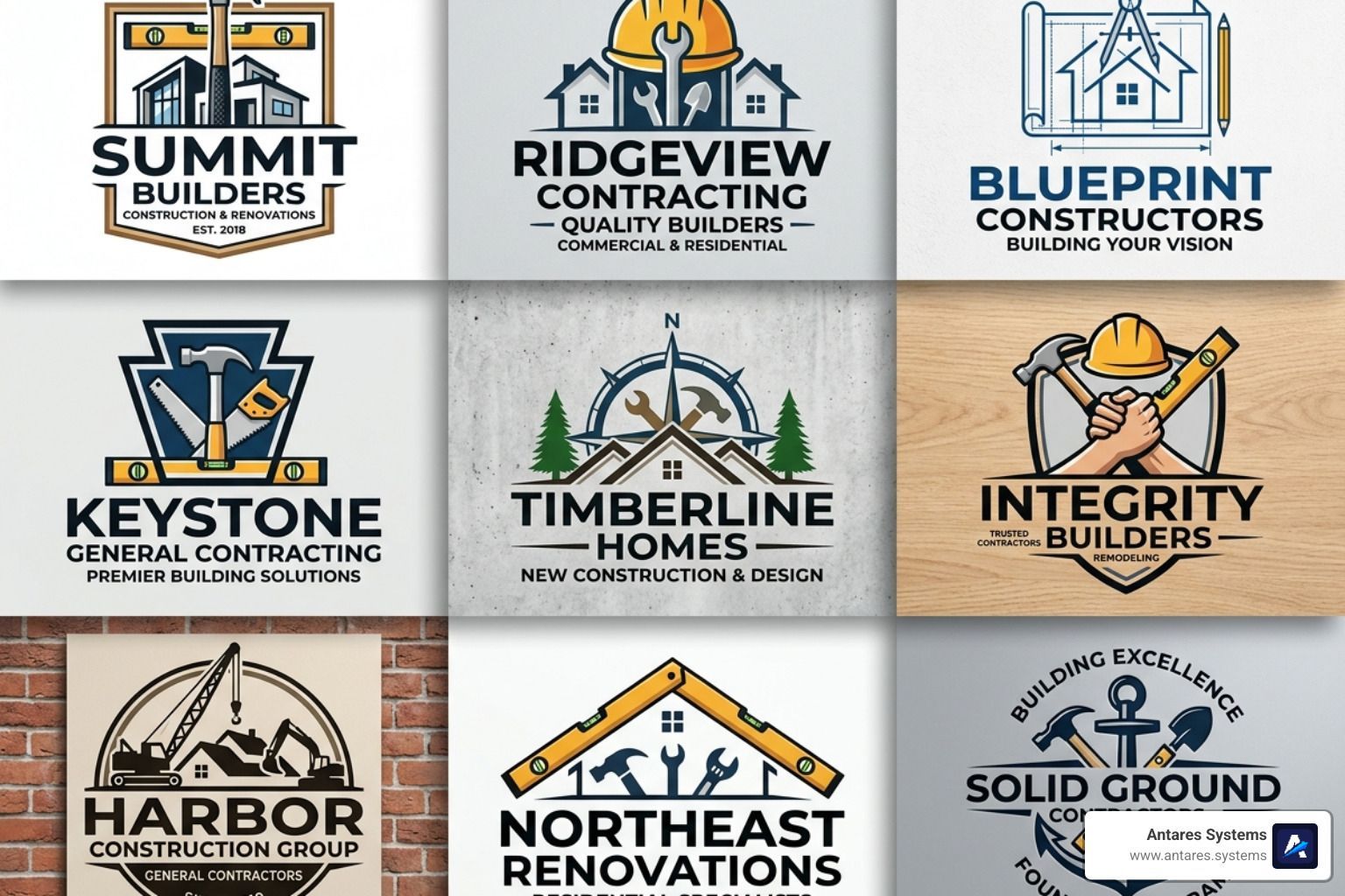
When we look at the most successful general contractor logos in the industry, they all share a common DNA: they communicate strength, reliability, and professionalism at a glance. In the construction market of 2026, you don't have time to explain what you do; your logo has to do the talking for you.
A professional logo serves as a visual shorthand for your company's values. Whether it's a bold General Contractor Construction Company Logo or a more subtle wordmark, the goal is to create an immediate sense of "this team can get the job done." To achieve this, designers often follow the Ten Golden Rules Logo Design , which emphasize simplicity, memorability, and versatility.
Incorporating Industry Symbols for Instant Recognition
The most effective way to signal your expertise is through the clever use of industry-specific symbols. However, the trend in 2026 is moving away from cluttered, literal drawings toward "smart" icons that use negative space or abstract forms.
Popular Symbol Trends:
- Negative Space: Creating a house silhouette within the head of a hammer or using the "gap" in a wrench to form a roofline.
- Tool Motifs: Subtle integrations of wrenches, hammers, or saws that don't overwhelm the brand name.
- Structural Outlines: Clean, geometric rooflines or crane silhouettes that suggest large-scale capability.
- Heavy Machinery: Excavators or bulldozers are excellent for earth-moving and site-prep specialists.
A great example is a General Contractor Construction Company Logo that combines a helmet with a building icon, instantly bridging the gap between safety and results.
Typography and Bold Lettering in General Contractor Logos
Typography is the "voice" of your brand. For general contractors, that voice needs to be deep, steady, and loud enough to be heard from a distance. We recommend using masculine, sans-serif fonts that prioritize readability above all else.
If your logo is going on the side of a truck moving at 60 mph through McAllen or Dallas, a thin, script font simply won't cut it. Modern trends favor:
- Bold Wordmarks: The company name itself is the star, styled in heavy, blocky lettering.
- Monograms: Using the company's initials to form a structural shape, like two "R's" forming the frame of a house.
- Scalability: Ensuring the font remains legible whether it's on a tiny Google Business Profile icon or a massive 10-foot job site banner.
For more on how typography fits into a broader brand strategy, check out our guide on Logo Design and Branding.
Choosing the Right Style and Color Palette
Color isn't just about what looks "cool"; it's rooted in psychology. In the construction industry, certain colors trigger specific feelings in potential clients. For example, blue is almost universally associated with trust and stability, while orange screams energy and safety.
When we look at Member Logos - Texas Association of Builders , we see a heavy reliance on high-contrast pairings. This isn't an accident. High contrast ensures your logo pops against a variety of backgrounds, from white invoices to muddy trucks.
Common Color Associations:
- Deep Blue & Charcoal: The "Corporate Professional." Ideal for commercial contractors looking to land big-ticket projects.
- Safety Orange & Black: The "Action-Oriented Team." Perfect for residential remodelers and emergency repair services.
- Forest Green & Earth Tones: The "Sustainable Builder." Great for contractors specializing in eco-friendly builds or landscaping.
Modern vs. Vintage General Contractor Logos
Choosing a style depends heavily on your target audience and your company's history.
Modern Style: Modern general contractor logos in 2026 are all about minimalism and flat design. These logos avoid shadows and gradients, making them incredibly easy to print on t-shirts or stitch onto hats. A General Contractor Construction Company Logo with a simple geometric house icon is a prime example of this "less is more" approach.
Vintage Style: On the other hand, many contractors in Austin and San Antonio are leaning into the "heritage" look. These logos often feature badge-style layouts, retro typography, and a "hand-drawn" feel. This style works exceptionally well for family-owned businesses that want to emphasize their long-standing reputation and craftsmanship.
Niche Specifics: Residential vs. Commercial Designs
Your logo should reflect the scale of your work.
- Residential Contractors: Often use symbols like rooflines, front doors, or "homey" elements to create a sense of approachability and comfort.
- Commercial Contractors: Focus on cityscapes, steel beams, or abstract geometric shapes that imply precision and large-scale engineering.
If you're an Industrial and Commercial General Contractor in Mission, TX , your logo needs to look "heavy-duty" to convince a facility manager that you can handle a multi-million dollar warehouse renovation.
Top Resources for Designing Your Construction Brand
You don't need to be a master artist to get a high-quality logo in 2026. There are thousands of resources available to help you find inspiration or even create a DIY version. However, for a truly Custom Website Design for Small Business , your logo needs to be high-resolution and professionally formatted.
If you are looking for physical branding like Builder and Contractor Signs and Graphics in San Antonio , you'll need vector files (like .SVG or .AI) to ensure your logo doesn't become a blurry mess when enlarged.
Leveraging Free Templates and Stock Assets
Platforms like Canva, Adobe Stock, and Freepik have made professional-grade design accessible to everyone.
- Canva: Offers over 2,100 free customizable construction logo templates. It's great for beginners who want to play with colors and fonts.
- Adobe Stock: Boasts over 56,000 contractor-related assets, including high-quality vector icons of helmets, tools, and buildings.
- Pinterest: A goldmine for inspiration. Searching for "general contractor logo" will show you hundreds of real-world examples from successful firms.
You can even find ready-made General Contractor Construction Company Logos that can be purchased and tweaked to fit your name.
Professional Customization vs. DIY Solutions
While DIY tools are great for starting out, there's a reason many contractors in Edinburg and Brownsville eventually hire a pro. A professional designer doesn't just "draw a picture"; they create a brand system.
They ensure your logo is a "digital-first" signal, meaning it looks just as good on a high-definition smartphone screen as it does on a business card. If you're looking for a Custom Logo Design in Edinburg, TX , a professional can help you find that "unique advantage" that sets you apart from the sea of generic hammer-and-house logos.
Common Mistakes to Avoid in Contractor Branding
Even with the best intentions, it's easy to fall into some common branding traps. Here are the red flags we see most often:
1. Using Generic Clip Art In 2026, customers can spot "stock" clip art from a mile away. If your logo looks like it came from a 1995 version of Microsoft Word, it signals that your business might be behind the times, too.
2. Overcomplication If your logo has a hammer, a saw, a crane, a house, and a 15-word slogan, it's too much. A cluttered logo becomes an unrecognizable blob when shrunk down for a Facebook profile picture.
3. Poor Scalability Always test your logo at different sizes. Does it still look good when it's only half an inch tall? If the text becomes unreadable or the lines blur together, you need to simplify.
4. Color Clashing Neon pink and lime green might be your favorite colors, but they probably shouldn't be your construction brand. Stick to high-contrast, professional palettes that reflect the stability of your work.
5. Ignoring Reputation Management Your logo is the "face" of your company. If that face is associated with poor service, even the best design won't save you. Integrating your branding with proactive Reputation Management ensures that when people see your logo, they think of 5-star reviews and quality work.
Frequently Asked Questions about General Contractor Logos
What colors are best for a construction logo?
The "big three" for construction are Deep Blue(trust), Safety Orange(visibility), and Charcoal/Black(strength). High-contrast pairings like black and yellow or navy and white are also highly effective because they are easy to read on trucks and job site signage.
Should I use a tool icon or a building icon?
It depends on your niche! If you are a specialized residential remodeler, a house silhouette or a roofline is perfect. If you are a heavy-duty general contractor, a crane, a gear, or an abstract structural symbol might better represent the scale of your projects. The best general contractor logos often use abstract symbols that can represent both.
How do I ensure my logo looks good on a truck and a website?
Always design in vector format(SVG or AI). Unlike standard images (JPG or PNG), vectors can be scaled to any size — from a tiny website favicon to a massive truck wrap — without losing quality. Also, keep your lines bold and your typography simple to ensure it remains legible from a distance. For inspiration on how logos translate to digital spaces, check out some of the Best General Contractor Websites.
Conclusion
A well-designed logo is the foundation of your business's visual identity. In the competitive landscape of the Rio Grande Valley and beyond, having a professional look isn't just a luxury — it's a critical tool for lead generation and business growth.
At Antares Systems, we understand that a logo is just one piece of the puzzle. We help small service-based businesses in McAllen, Edinburg, Mission, and across Texas build complete, AI-powered marketing systems. From Logo Design and Branding to smart websites that capture and follow up with leads automatically, we're here to help you grow without the stress of juggling multiple vendors.
Ready to build a brand that stands out? Let's get to work.