Make Your Website Mobile-Friendly: How to Ensure a Great User Experience for All Devices

Make Your Website Mobile-Friendly: How to Ensure a Great User Experience for All Devices
In today's digital age, it's more important than ever to have a mobile-friendly website. Nearly 60% of all internet traffic now comes from mobile devices; With so many people using their smartphones and tablets to access the internet, if your site isn't optimized for mobile devices, you're losing out on a lot of potential customers. In this blog post, we'll discuss some tips on how to make your website mobile-friendly and provide a great user experience for all devices!
- 1. The importance of having a mobile-friendly website
- 2. The benefits of having a mobile-friendly website
- 3. How to make your website mobile-friendly
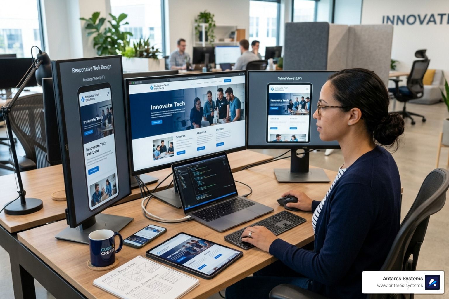
- 1. Make sure your website is responsive
- 2. Use a mobile-friendly template or design
- 3. Optimize your images
- 4. Use a mobile-friendly font
- 5. Keep your content short and concise
- 4. Tips for creating a great user experience for all devices
- 5. Additional resources on making your website mobile-friendly
- Mobile responsive design: Antares Systems
1. The importance of having a mobile-friendly website
As small business owners, we all understand that in order to stay competitive, we need to have an online presence. In today's digital age, potential customers are searching for businesses like yours on the internet using their mobile devices. If your website isn't mobile-friendly, you're losing out on a lot of potential business.
A mobile friendly website, also called mobile responsive sites or just responsive websites, are those that have been designed to resize and adjust according to the screen size of the device being used. This means that whether a customer is viewing your website on a desktop computer, a laptop, a tablet, or a smartphone, the site will adjust to fit the screen.
Not only does this provide a better user experience for your customers, but it also shows that you're keeping up with the latest technology trends. Mobile friendly websites are important for a number of reasons:
First,
as we mentioned, more and more people are using their mobile devices to access the internet. If your website isn't optimized for mobile devices, you're likely losing out on a lot of potential customers or website visitors.
Second, mobile friendly websites provide a better user experience for all users. A well-designed mobile website will load quickly and be easy to navigate, regardless of the device someone is using. This is important because a good user experience is essential for keeping people on your site and engaged with your content.
Finally,
Google now penalizes websites that are not mobile friendly in their search rankings. This means that if your website isn't mobile friendly, it's likely that you're not showing up as high in the search results as you could be. And since most people don't go past the first page of search results, this can have a significant impact on your website's traffic.
2. The benefits of having a mobile-friendly website
Having a mobile site might seem like a lot of extra work, but the truth is, it's worth it! Mobile-friendly websites provide a number of benefits for both businesses and their customers.
Some of the benefits of having a mobile-friendly website include:
- Increased traffic: As we mentioned earlier, more and more people are using their mobile devices to access the internet. If your website isn't optimized for mobile devices, you're likely missing out on a lot of potential website visitors.
- Better search engine ranking: Google now penalizes websites that are not mobile-friendly in their search rankings. This means that if your website isn't mobile-friendly, it's likely that you're not showing up as high in the search results as you could be.
- Improved user experience: A well-designed mobile website will load quickly and be easy to navigate, regardless of the device someone is using. This is important because a good user experience is essential for keeping people on your site and engaged with your content.
- Increased sales: A mobile-friendly site provides a better user experience, which can lead to increased sales and conversions.
- Improved customer satisfaction: Mobile-friendly website design is easy to use and provides a great experience for customers, which can lead to increased customer satisfaction.
There are a number of other benefits of having a responsive site as well. But these are some of the most important ones.
If you're not convinced yet, keep reading to learn more about how to make your website mobile-friendly!
3. How to make your website mobile-friendly
A mobile optimized website design is essential for businesses today. Nowadays, almost everyone has a smartphone or mobile device, and most people use their mobile devices to access the internet.
That's why most of the websites that are or have been created in the last few years tend to have a responsive design. In order to make mobile optimized sites, you need to make sure that it has a responsive design.
1. Make sure your website is responsive
One of the most important things you can do to make your website able to adapt to a mobile version is to make sure it's responsive. This means that the website will automatically adjust to fit the screen of whatever device it's being viewed on. This provides a better user experience for your customers, regardless of what device they're using.
There are many tools available that can help you test whether or not your website is responsive.
Google Pagespeed Insights is one of them. This tool will give you a detailed report on how your website fares in terms of responsiveness and what you can do to improve it.
Another tool you can use is
Google's Mobile-Friendly Test. This tool will give you a quick overview of how your website looks on a mobile device and whether or not it's easy to use. It is similar to Pagespeed Insights, but it doesn't provide as much detail, it just tells you whether or not your site has mobile optimization.
2. Use a mobile-friendly template or design
If you're not sure whether or not your website is responsive, or if you want to update your website to be more mobile-friendly, you can use a mobile-friendly template or design. There are a number of different templates and designs out there that are specifically designed for mobile devices, and they're easy to use.
If you're using WordPress or any other
website builder, there are many mobile-friendly themes available. All you need to do is install the theme and activate it, and your website will be automatically optimized for mobile devices.However, some of them are not flexible or personalizable.
If you're not using WordPress, there are still many mobile-friendly templates and designs available. You can find them by doing a search for "mobile-friendly templates" or "responsive designs."
Also, if you don't have a website or you don't know how to start, there are a number of
companies that offer mobile website design. Antares Systems is one of them. We offer responsive website design and development.
We can help you create a responsive website that looks great on all devices, from a desktop site to a mobile site. Contact us today to learn more about our services!
3. Optimize your images
Another thing you can do to make your website more mobile-friendly is to optimize your images. This means reducing the file size of your images so they load quickly on all devices. You can do this using a tool like Photoshop or TinyPGN.
You can also use a WordPress plugin like WP Smush to optimize your images automatically. This plugin will reduce the file size of your images without losing quality, making them load faster on all mobile phone and all devices.
4. Use a mobile-friendly font
Another thing you can do to improve the usability of your website on mobile devices is to use a mobile-friendly font. There are many different fonts that are designed for mobile devices, so you have plenty of options to choose from.
You might be wondering why it's important to use a mobile-friendly font. The reason is that some fonts are difficult to read on small screens. This can make it hard for your customers to read your content, which is why it's important to use a font that's easy to read on all devices.
Some
mobile-friendly fonts include Arial, Helvetica, and Verdana. These fonts are all easy to read on mobile devices and they're widely available, so you shouldn't have any trouble using them on your website.
5. Keep your content short and concise
One of the biggest challenges when it comes to creating content for mobile devices is making sure it's short and concise. People are more likely to read shorter pieces of content on their mobile devices, so it's important to keep that in mind when writing your content.
This doesn't mean that you have to write less content, it just means that you need to be more concise with the content you do write. Get to the point and make sure your content is easy to read.
You can also use headings and subheadings to break up your content and make it easier to read. This is a great way to keep your readers engaged and ensure they're able to understand your content.
By following these tips, you can ensure that your website is mobile-friendly and provide a great user experience for all devices!
4. Tips for creating a great user experience for all devices
Creating a Great User Experience for All Devices is important to consider when Make Your Website Mobile-Friendly. Here are a few tips:
- Invest in SEO: If you want your website to rank high in search engine results pages (SERPs), you need to invest in SEO. This will help ensure that your website is visible to mobile users who are searching for the products or services that you offer.
- Make sure that your website fits many screen sizes: People use all sorts of devices to access the internet these days, from big desktop monitors to small smartphone screens.
- Design for touchscreens: This means that buttons and links should be large enough to be tapped on easily, and that menus should be easy to navigate.
- Keep just relevant content: When it comes to mobile devices, people are often looking for specific information quickly. They don’t want to wade through loads of text to find what they need, so make sure that your website only includes the most relevant content.
- Keep track of web traffic: Use Google Analytics or another similar service to track how people are accessing your website. This will give you valuable insights into what’s working and what isn’t, so you can make necessary changes.
By following these tips, you can create a website that is mobile-friendly and provides a great user experience for all devices!
5. Additional resources on making your website mobile-friendly
As you can see, mobile optimized websites are important to have in this day and age. Here are some additional resources on making your website mobile-friendly:
- Google’s Mobile Guide: This guide from Google will teach you everything you need to know about making your website mobile-friendly.
- Lighthouse: Lighthouse is an open-source tool that can help you audit your website and identify areas that need improvement.
- Core Web Vitals: These are a set of metrics that measure the performance of your website. Make sure to check them and improve your website accordingly.
- Googlebot Mobile: This is Google’s mobile crawler, which is used to index websites for mobile search. If you want your website to be indexed properly, you need to make sure it’s mobile-friendly.
By following these tips and resources, you can be sure that your website is mobile-friendly and provides a great user experience for all devices!
Mobile responsive design: Antares Systems
Creating a website that is mobile-friendly and provides a great user experience for all devices can be challenging, but it's important to consider these factors when making your website. By following the tips and resources provided in this document, you can create a website that is optimized for mobile devices and meets the needs of your visitors.
If you have any questions about making your website mobile-friendly or about responsive design in general, please don't hesitate to contact us. At
Antares Systems, we specialize in
website design and we can help you create a website that looks great on all devices. Contact us today to learn more!