Is Your Website Smart? The Art of Responsive and Modern Web Design
Is Your Website Losing Customers Right Now?
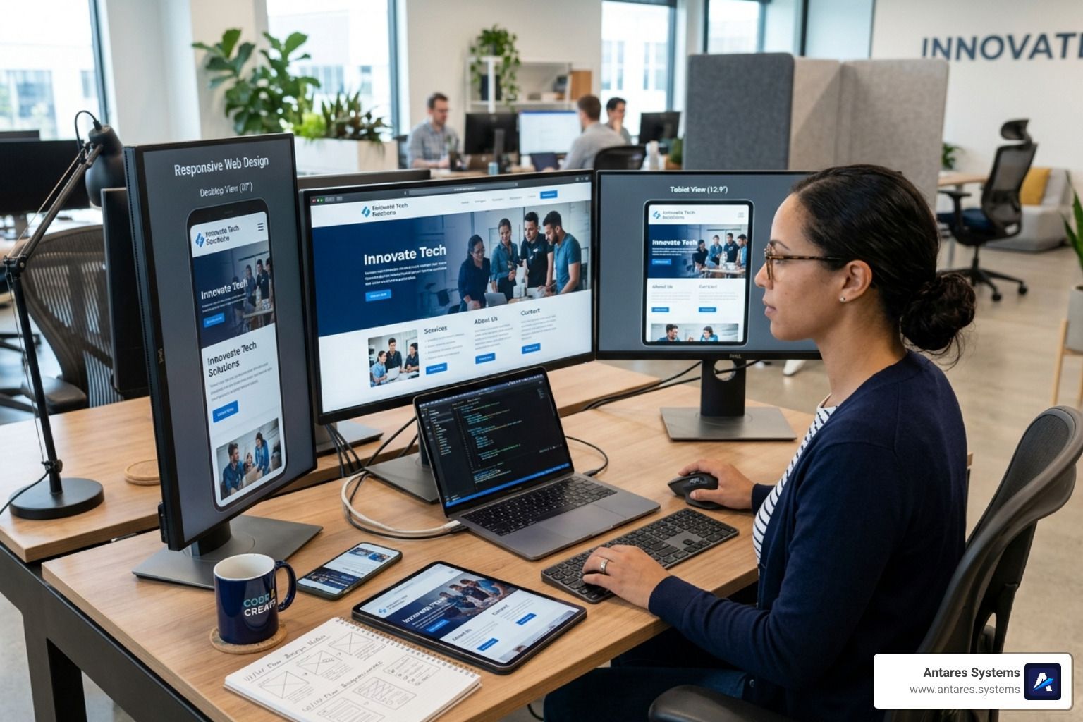
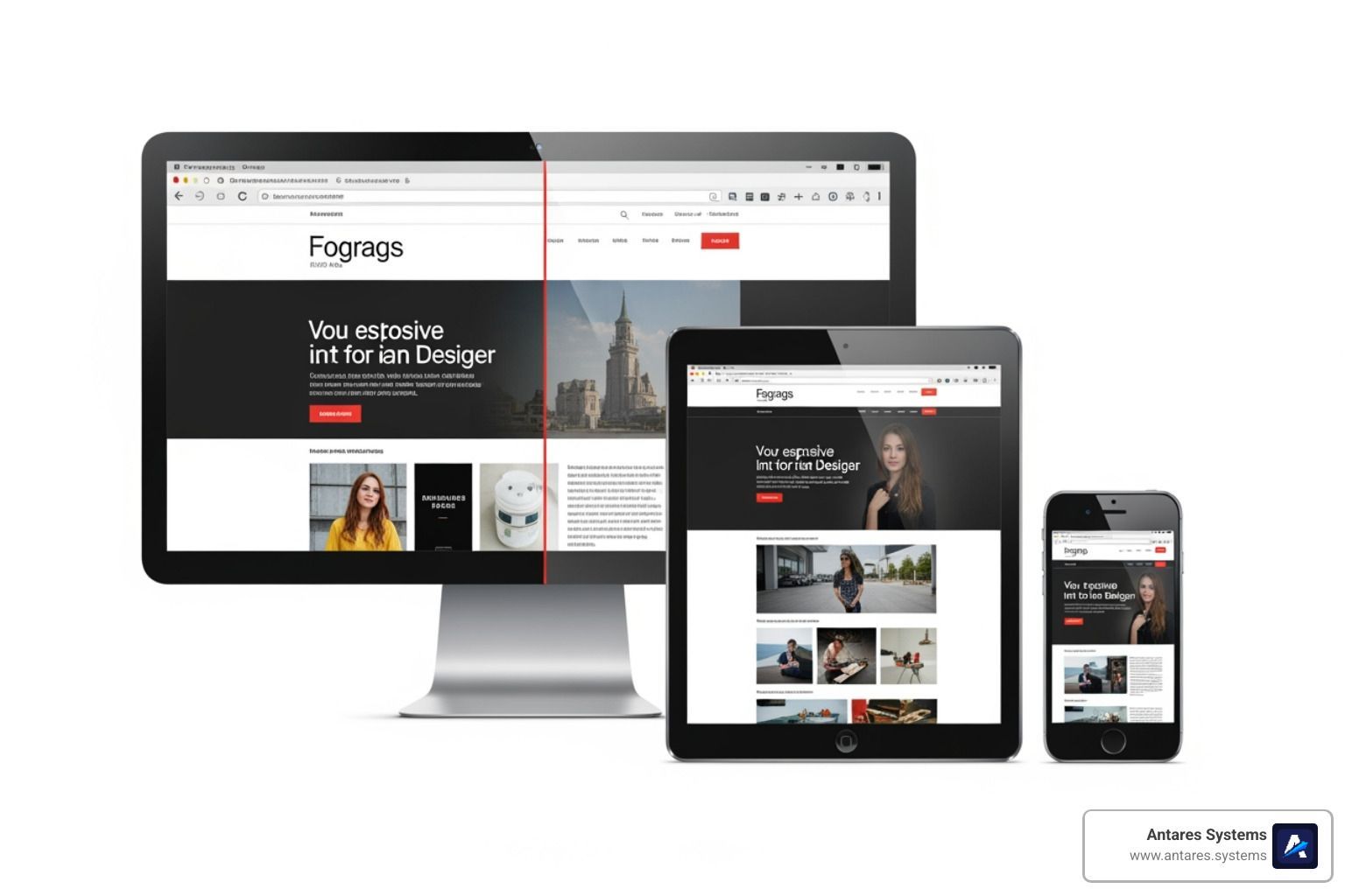
Responsive web design is the practice of building websites that automatically adjust their layout, images, and content to look great and work well on any screen — phone, tablet, or desktop.
Here's what that means in plain terms:
- A responsive site rearranges itself based on the device viewing it
- Text stays readable, buttons stay tappable, images stay sharp
- One website works everywhere — no separate mobile version needed
- Google ranks responsive sites higher than non-responsive ones
- Over 60% of all web traffic now comes from mobile devices
If your site isn't responsive, more than half your potential customers are getting a broken experience — and most of them won't stick around.
Think about the last time you landed on a website from your phone and had to pinch, zoom, and scroll sideways just to read it. Frustrating, right? That's exactly what your customers feel when your site isn't built to adapt. Ethan Marcotte, the designer who coined the term "responsive web design" in 2010, described the goal simply: a single website that responds to any viewing environment, rather than a separate site for every device. That idea changed how the entire web is built — and it's now the baseline expectation for any business website.
For small business owners in the Rio Grande Valley, this isn't a technical nicety. It's the difference between a potential customer calling you or calling your competitor.
I'm Angela D., an SEO Account Manager with a background in IT and software development who has spent years helping businesses improve their online visibility through smart, search-optimized design — including implementing responsive web design strategies that drive real, measurable growth. In this guide, I'll walk you through everything you need to know to make your website work for every customer, on every device.

What is Responsive Web Design and Why Does Your Business Need It?
At its heart, Responsive web design is an architectural approach. Instead of creating three different versions of your website for phones, tablets, and desktops, we build one "smart" site that detects the size of the screen it's being viewed on and rearranges itself accordingly.
Imagine a bookshelf that magically shrinks to fit in a hallway or expands to fill a library wall, all while keeping the books perfectly organized and easy to reach. That is what a responsive site does for your content.
Research shows that 60% of all web traffic comes from mobile devices. If your site isn't optimized for those users, you aren't just losing "mobile traffic"—you're losing more than half of your potential business. This is why we advocate for 7 reasons why you need a professional website design, with responsiveness being at the very top of that list.
The Technical "Magic" Ingredients
To make a site truly responsive, we use three core technical ingredients:
- Fluid Grids: Instead of using fixed units like pixels (which stay the same size regardless of the screen), we use percentages. A column that takes up 50% of the screen will look half-sized on a phone and half-sized on a massive monitor.
- Flexible Images: We set images to have a maximum width of 100%. This ensures they never "break" the layout by being wider than the screen they are on.
- Media Queries: These are snippets of CSS code that act like a set of instructions: "If the screen is smaller than 600 pixels, stack these two columns on top of each other."
Future-Proofing and Conversion Rates
The beauty of Responsive web design is that it is "device agnostic." Whether your customer is using an iPhone 15, an old Samsung tablet, or a brand-new smart fridge, a responsive site will adapt. This "future-proofs" your investment. You won't need a redesign just because a new screen size hits the market next year.
Furthermore, a seamless experience directly impacts your bottom line. When users can find what they need without friction, they are far more likely to convert into leads.
The Evolution from Mobile-Friendly to Responsive
In the early days of the mobile web, designers used "mobile-friendly" tactics that were often clunky. We used to see "m.website.com" subdomains—separate, stripped-down versions of a site specifically for phones. This required "browser sniffing," where the server tried to guess what device you were using.
As the Responsive Web Design (RWD) - Glossary | MDN points out, the shift to true RWD moved us away from device-specific designs toward content-driven layouts. Instead of designing for "the iPhone," we now design for the content itself, letting the layout break and reform at whatever points the content starts to look crowded or messy.
Business Impact and SEO Benefits
For businesses in McAllen, Edinburg, or Brownsville, SEO is the lifeblood of growth. Google has moved to mobile-first indexing, which means Google primarily uses the mobile version of your content for indexing and ranking. If your mobile experience is poor, your desktop rankings will suffer too.
A responsive site offers several key business advantages:
- Lower Bounce Rates: Users stay longer when the site is easy to navigate.
- No Duplicate Content: Since you only have one URL for both mobile and desktop, you don't risk being penalized by search engines for duplicate content.
- Cost Efficiency: Maintaining one codebase is significantly cheaper and faster than managing multiple versions of a site.
- Improved Local SEO: When customers in the Rio Grande Valley search for "construction services near me" on their phones, a mobile-optimized site is much more likely to show up in the "Map Pack."
Our focus at Antares Systems is on effective website design businesses can actually use to grow. We don't just make things look pretty; we make them work for your specific business goals.
The Technical Pillars of Responsive web design
To build a site that truly "responds," we have to look under the hood. While you don't need to be a coder to understand the value, knowing the pillars of the technology helps you make better decisions for your business.
Setting the Viewport for Success
The most critical line of code in any responsive site is the viewport meta tag. Without it, mobile browsers "lie" to the website. They pretend they are 980 pixels wide (a standard desktop width) and then zoom out to fit that onto your phone screen. This results in tiny, unreadable text.
The fix is a simple tag: <meta name="viewport" content="width=device-width, initial-scale=1.0">
. This tells the browser: "Match the width of the site to the actual width of the device, and don't zoom out." This is the first step we take when we make your website mobile-friendly how to ensure a great user experience for all devices.
Mastering Layouts with Flexbox and CSS Grid
Modern web design has moved far beyond old-fashioned "tables" or "floats." Today, we use two powerful layout systems:
- Flexbox: Perfect for aligning items in a row or column. It’s great for navigation bars or "feature" sections where items need to shrink or grow to fill the available space.
- CSS Grid: This is the "big brother" of Flexbox. It allows us to create complex, two-dimensional layouts. We can define a 12-column grid for desktop and tell the site to automatically collapse it into a 1-column grid for mobile.
Using these tools allows us to achieve structural responsiveness. Instead of just "fixing" a page, we build components that know how to behave. This is a core part of how to design a website that stands the test of time.
Breakpoints: The "Snap" Points
A "breakpoint" is the specific screen width where the layout changes. For example, we might have a breakpoint at 768 pixels (the width of an iPad in portrait mode).
- Major Breakpoints: These handle the big shifts, like moving from a three-column layout to a single column.
- Minor Breakpoints: These handle the small stuff, like adjusting the font size or padding so a headline doesn't look awkward on a specific phone size.
As suggested by Responsive web design basics | web.dev, the best practice is to "start small and work up." We design the mobile version first, then expand the screen until the layout starts to look "broken"—that’s exactly where we put our breakpoint.
Beyond the Layout: Typography and Media in Responsive web design
A responsive layout is useless if the images are blurry or the text is so small you need a magnifying glass.
Responsive Typography
In the past, we set font sizes in pixels (px). In Responsive web design, we prefer relative units like rem
or vw
(viewport width).
-
vwunits: Setting a font to5vwmeans it will always be 5% of the screen width. - The
calc()function: To prevent text from getting too small on phones or too large on monitors, we often use code likefont-size: calc(1rem + 2vw);. This gives us a base size that scales gracefully.
For more on this, check out our ten tips for unbeatable business website guide, which emphasizes readability as a key conversion factor.
Optimizing Images and Video
Images are often the heaviest part of a website. If you load a massive 4K desktop image on a 4G mobile connection in Pharr or Mission, your site will be painfully slow.
-
max-width: 100%: This is the golden rule. It prevents images from overflowing their container. - The
<picture>element: This allows us to serve different images to different devices. We can show a wide landscape photo on desktop and a cropped, vertical version of the same photo on mobile. -
srcset: This tells the browser: "Here are five versions of this image in different sizes. Pick the one that fits the user's screen best."
This level of detail is what separates a DIY site from the Responsive web design - Learn web development | MDN standards we follow.
Designing for the Human Element
Responsive design isn't just about screens; it’s about fingers. On a desktop, we use a precise mouse. On a mobile device, we use our thumbs.
- "Think about thumbs": Most people hold their phones with one hand. We place the most important buttons (like "Get a Quote") in the "natural" reach of the thumb.
- Touch Targets: Buttons should be at least 44x44 pixels to avoid "fat-finger" errors where a user accidentally clicks the wrong link.
- Fitts' Law: This scientific principle states that the time to move to a target depends on the distance to and the size of the target. In short: make your Call-to-Action buttons big and easy to reach!
Testing and Frameworks for Modern Web Success
How do we ensure a site works on the thousands of different devices out there? We use a combination of powerful tools and proven frameworks.
Popular Frameworks
Frameworks like Bootstrap or W3.CSS provide a "library" of pre-built responsive components.
- Bootstrap: The most popular CSS framework in the world. it uses a 12-column responsive grid system that makes it very fast to build complex layouts.
- W3.CSS: A smaller, faster alternative that doesn't require JavaScript, making it great for performance-focused sites.
While these frameworks are helpful, we always customize them. An over-reliance on "stock" frameworks can make your business look like everyone else’s. We focus on website redesign how to revamp a website by tailoring these tools to your unique brand identity.
Testing Your Site
You don't need to buy 50 different phones to test your site. We use:
- Chrome DevTools: By right-clicking any page and selecting "Inspect," we can toggle "Device Mode" to see exactly how a site looks on an iPhone, Pixel, or iPad.
- Lighthouse Audits: This is a tool built into Google Chrome that gives your site a "score" for performance, accessibility, and SEO. It specifically checks if your content is sized correctly for the viewport.
- Real-World Testing: Nothing beats actually loading the site on a phone while walking through a "spotty" signal area in Edinburg or Mission to see how it performs in the real world.
Common Pitfalls to Avoid
Even experienced designers sometimes fall into these traps:
- Fixed-Width Elements: If a single image or table has a fixed width of 800px, it will "break" the mobile layout and cause horizontal scrolling.
- Hiding Essential Content: Never hide your contact info or "services" just to make the mobile page shorter. If it's important on desktop, it's important on mobile.
- Ignoring Performance: A beautiful responsive site that takes 10 seconds to load is a failure. Speed is a critical part of the user experience.
If you have more questions about the process, our website design faq covers many of the common concerns local business owners have.
Frequently Asked Questions about Responsive Web Design
What are the three basic requirements for responsive design?
The three pillars of Responsive web design are:
- A Fluid Grid: Sizing elements in percentages rather than fixed pixels.
- Flexible Media: Ensuring images and videos scale within their containers.
- Media Queries: CSS code that applies different styles based on the device's screen size or resolution.
How does responsive design differ from adaptive design?
While they sound similar, they are different approaches:
- Responsive Design: One layout that fluidly changes and "flows" to fill any screen size. It is the most "future-proof" option.
- Adaptive Design: The designer creates several fixed layouts (e.g., one for 320px, one for 768px, one for 1024px). The site detects the device and "snaps" to the closest layout. It is often more work to maintain.
Why is the viewport meta tag essential?
The viewport meta tag is the "instruction manual" for mobile browsers. Without it, a phone will try to display your desktop site in its entirety, making everything tiny and impossible to use. It forces the browser to use the device's actual width and sets the initial zoom level to 100%.
═══ BUILDING A SMARTER WEB PRESENCE
Responsive web design is no longer an optional feature; it is the foundation of a successful digital strategy. By prioritizing fluidity, performance, and user intent, businesses can ensure they remain competitive in a mobile-first world.
Antares Systems specializes in creating high-performance, AI-powered websites that do more than just look good—they convert. Based in McAllen, Texas, we help local service-based businesses across the Rio Grande Valley implement smart designs that capture leads and automate growth.
Ready to transform your digital presence? • Explore our professional web design services • Learn about our local SEO solutions • Get a free website audit today